Wednesday, 25 November 2009

blog 7-planning and evaluation of the article

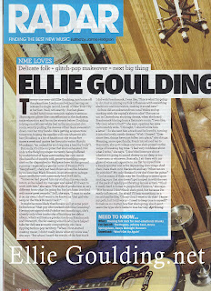
In this article from an NME issue, it is writing from 3rd person as if the writer is imagining what Ellie Goulding feels when she waskes up. There is a use of romanticised language in here with word like "glitter" and "constellations". It then takes bit from the interview and quotes things she may have said before, "My God. What is that?" I feel that the tone of the article can be humerous in places by describing her actions "cartoonishl". However using romantic language emphasises the serious tone of her popualrity. It is informative but at the same time has an informal tone. I like the way this article is layed out and the way the language fits the artist. I think this is the sorf of writing tone I would like to use. One that is informative, but fun and flows with informality. I like the idea of writing how the artist felt at the time and looking at it from 3rd person. This was a mixture of a review and an interview. A review as it is reviewing how the artist became famous and an interview by adding quotes/ things that have been said in an interview.


DRAFTS : Beginning for the Assasins.


"They're hearts pounded".


"Overwhlemed with excitement".


"Energy" "Interest"


I want there to be a sense of raomace as the band I have chosen to write about are a couple and I want some of their relationship to filter through the article for my target audience to see what goeson witha couple in a band. I want to create an image of what it's like to play at gigs and I feel this is great practise for when I write reviews when I am older!


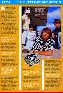
In the article above for SMASH HITS magazine, it is very different to the NME interview. Here it starts with a clear inroduction about the band and straight into telling the reader who they are and what they are about. This magazine article was written in the 1990's so styles of writing have changed up to recent times. It takes on a more humourous tone to reflect the artist's humour from both the writer and the artist, "horrible trouserwear". I think the writer is witty in his comments about the band and in the introduction states them as "dishy". This creates a humorous tone and it seems like the wrtiter is playing around with words to make an informal tone and can make the reader feel relaxed and laugh! Compared to the NME article, it has a completely different layout and one block colour. The writer doen't display any of the questions the interviwere may have asked, instead they layout big sub titles in a bigger font and in a different colour to the body text about them and then goes onto say something to do with the sub title for example "THEY WANT TO SAVE THE WORLD!" ..."Our aimns are to reconcile the Russains and Americans and eradicate all diseases and...that's about it. I can't think of anything else." I think this tone is very humourous and the band member uses language which seems higher to his normal talk and seems as though he is kind of joking around and making fun out of problems in the world. The writer includes every detail of what the band is saying which I think it is cleverly done as it is not too much, but still enough to give out to the reader who the band are and what they do, what they're like etc.


They are two very contrasting articles, the language is very different and the tone, the same as the layout. The NME article doesn't use any pictures of the artist whereas the Smash hits uses two, one of the band with an insert of who they are "left to right", and example of what they consider "art" using a painter's work, which even visually sets an immidiate tone for the reader of humour. The contrasting articles shows how much time has moved foward about appreciating different audience's. The SMASH HITS in the 90's is completely different to what it is now as the article I picked seems more adult appropriate rather than young teens. However today it is considered a tweeny magazine designed for a younger audience.


DRAFTS FOR ARTICLE LIKE THIS ONE.

"Laugh at bad romance!"

"We fell in love on stage and proposong wasn't hard. It's funny when it's other people but when you do it it's romantic!"


drafts

They're hearts race with excitement and the rush of fame becomes a blur. She dances and he laughs. They're energies that filled the room with excitement...the crowd goes wild! The noise! awards presents the assasins.

the critically acclaimed 'Assasins' two induviduals that started as friends and are now engaged. their love and passion for music fused their love together. "It all started when we met as a friend's birthday party." Explains Izzy. "I carried around with me my acoustic guitar everywhere." Little did Izzy know, Nathon was the lead singer in a band he had formed..."she was awesome!" He then took an interest in Izzy's work and later discovered that they were noth signed to the same Indie Label locally made as did the Spaniel's Ears. "I decided to work with Izzy as a side project from my other band, but then she became my only project as we made beautiful musioc together.". Their style is a corss between the passionate lyrics by Kate Nash, but the drumming and electro from Enter shikari and MGMT. They were scouted whilst playing intimate gigs by Excel Records and promoted them to THE NOISE awards. building a huge fan base within their first year of gigs, they are now hugely loved by many ages and people for their romantic story and their success. "it felt amazing to play at the awards!" Exclaims Izzy. "the rush in front of thousands of people has built our confidence and driving us to be successful as the white stripes!" Tells Nathon. They take it in good humour to be the bad romance as nathon proposed to her on stage after their last performance at the awards. we expect great things from these guys!


Thursday, 12 November 2009

blog 5-fonts

I am thinking about using both serif and sans serif fonts for my front cover/contents and double page spread. this won't be used on the main body text for the article as sometimes this can be hard to read. thinking about my ideal audience also, this will seem to informal if I used it everywhere. I want to use some serif fonts i want to give it a retro feel like an iconic music magazine such as Rolling Stone. I have thought about colour and for the fonts i will be using mainly black/red/navy. The other colours, red and yellow will be used for fonts for the masthead,eading and titles. It will appeal to my target audience as I want it to attract a wide spread audience that like music influentuated by iconic bands such as the beatles which is where the retro and old fashioned vintage font come into it. I want some in bold for the Drop cap and matheads etc. The text body I feel would be better as standard as then it is still easy to read. Quotes and some of the interview will be put in italics as people can identify them as quotes. I haven't decided a particular specific font yet as I haven't finished browsing and expermenting. I know I want my masthead to be a font from a website that I can download onto a computer and have one that stands out. It will be in either yellow and black, or black and red. I feel these are attractive and appealing coloured fonts for my target audience as it doesn't give it a specific gender to be aimed at which was what I was wanting.


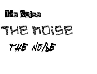
These three fonts are for my main masthead. I like all three but I think I will choose the first one it is written like a glow stick onto a dark background and I feel this would relate to my target audience as I want it to appeal to people who got to events like Global Gathering and Reading festivals etc.


These are other fonts I have decided to choose for my contents page and double page spread headlines. I browsed alot over different font websites but I decided to use http://www.dafont.com/, this is becasue it had all sorts of different styles of fonts that can create lots of different moods to the magazine. The two out of these samples I like best were 'GF ORDNER' and 'THE NOISE' which is a font I chose for my front cover masthead, The noise is the name of the magazine. I edited the colours form the original to make it the colour sheme I am using which is Red and Black.

These fonts are more of the choices for main heding/subheadings/ taglines on my 4 pages. I have picked a selection of serif and sans serif fonts to choose from. I will pick one that best suits the images and that compliments it. As I couldn't get my fonts to be placed in the Indesign Fonts, I copied and pasted them into paint and cropped them down to be fitted with space I made in Indesign. I have ade it blend in with my colour scheme of Navy, White, Red, Blue, Yellow and Pink. I fell it gives it an edgier image with blocks that are different to the rest. I used "Bohemian Typewriter" for my the contents page main information title"The Bad Romance?". I also used this font for page numbers and used the same idea of copying and pasting in the image rather than typing to make it look like it is meant to bwe there and not a fault with me ort the computer. I feel it worked well though! I used the font "impact" as the navigators on the contents page of heading for each section of the magazine and what page number they are on, in the sriking colour yellow so that they would stand out! This was onto a Navy background so that the reader could see it well. I have used the same idea of boxes around my navigaors like with the mast head and the main body information. Again, this was to blend in the theme of boxes and an edgier feel. I also used "~Impact" on the front cover of my magazine as the caption of one of the main sells images. Again, this was in yellow with a page number. I feel that this font is attractive and appealing to my target audience with an edge and something solid. Similarly to NME's and Kerrang's Block writing which shows a sturdy FOnt for their masthead's, one being faded and roicky and the other being Bold and simple but effective. I feel that some of the fonts I found reflected Fonts used that I had seen in NME and Kerrang which a hard and solid or serif to show a retro feel. Contrasting this to my evaluation of SMASH HITS! magazine which is girly, pop like and fun attracting a tweenie audience. NOT appealing to mine! On my fornt cover I also used 3 fonts that were hard to find whilst editing my front cover. I had to recover al of them and fix links I chose MTF Base Line and After Shok fonts both from http://www.dafont.com/ and ChromosomLight from http://www.fontstock.net/ . I used these font on my front cover as I felt they matched the theme of my magazine and looked distroted, similarly to KERRANG! It gave an edy, rock feel to the front cover mix and matched with the party like image.

For my Contents page, again I used Impact for the main navigators like headlines for the contents and for the page number. I used the noise font I used for my masthead again by placing it there and used Corbel for the body text writing.

For my double page spread, on the side with the picture, to create a sense of formailty I used impact again, the same "THE NOISE!" banner as before, corbel for the web address and etails of downloads, and ERAS medium itc for the quotes, and the tagline of the band. I used bohemian typewriter at the bottom of each page as navigators for the page numbers. Underneath the noise! banner I used impact font for part of the article "awards coverage"in yellow as to be seen as a part of the navigator for the reader to know who and what they are reading. For my main article on the double page spread , the main body text was written in Eras medium itc. I like this font as it gave a romantic tone to my text and relfects I feel what the artist is about. The head line ASSASIN was written in Broadway. I htink this reflects the band's success in a short amount of time and the 'saviours' of music relfects this in my text.
I am happy with the fonts I used however disappoint that some of them I wanted to use didn't save, so I had to save them as JPGs.

Wednesday, 11 November 2009

briony barret blog 4 flat plans.


<-- frony cover design i have chosen
For my front cover flat plan, i have created a rough idea of where abouts i want to place all the elements which make up a front cover. I have used the rule of thirds once again to recognise my points of power and where i want to place particular things to draw more attention to the audience. I have experimented with different colour schemes and I felt that Black,Yellow, White and Red. These colours conform to both of the front covers i loooked at in my previous blog. i felt that these colour compleimented achother well but I will make sure that I place them in a certain way so they don't clash or that I have more colours than others. This is appealing for both male and female audience as they are non specific colours related to what sex you are. I feel these are attractive and exciting enough to appeal to my age range of my target audience, between 14-37. my layout design appeared from inspiration of not only the magazines in my previous blogs, but i searched around on the internet and in shops to think of new ideas and where to place my masthead etc. the top half of my front cover has looked at both NME and Smash Hits and combined their placing of the masthead together. i placed my mathead in the top left hand corner with a headline runnning across the topnext to it. this is like NME and Smash Hits but their headline is above the masthead. this is giving extra information about what else is in the magazine. there will be a picture next to it relating to either the headline or about anything else in the magazine with a caption underneath. to make my tagline stand out, instead of it being underneath my masthead, i have ran the tagline along side of it at a vertical angle. along the bottom of the front cover will be more main sells and srtap lines. at the start of the strap line will be a little circle/ rectangle with a "plus" inside of it to show what else in i the magazine. they will each have page numbers on them so i am also using navigation elements on the front. the barcode is going to be placed vertical along the bottom of the right hand side. this will also include the price, date and the issue number. all of these are navigation elements used. to create a sense of informity, i want to border each of the main sells etc. with a block colour so it looks like they have been cut/ ripped out off of a page. i feel it will create and edgier, funky loko and attracting t my target audience as i want my ideal reader to be the sort of person who isn't always well organised and like things edgy and sometimes scruffy. it is creates an artistic ad eccentric feel with they way the edges are jagged and rough. the main image will be more to the left of the page as the front covers i llookied at placed their either in the centre, or to the right so i want mine to be more left placed but spreading through to the centre. i have taken the idea of using a title and information box overlapping the image. this is not going to be boreder as it will be taking half of the image away. there will be contrasting colour used for the title and the text underneath which will be short but using a quote from the article, that way the reader knows that there should be a double page spread in the magazine as it has taken up the front cover. the font i will be using over the front cover is going to be in sans serif to create a feeling of informity. at the same time, i am hoping to create a retro feel to the magazine by using funky and maybe old fashioned fonts. i have decided to design two front covers as i thought it would be interesting to experiment with different ideas. i decided to stick to the first one i oriigionally thought as i felt it was more interesting than my second layout design. this is because the second one seems very plain and boring the way that everthing mas mainly central and the point of powers on my grid lines weren't anywhere specific and eye catching. i htink if i make an image which is exciting and fits in well with my cover than it will look great. the second design seemed too basic for the audience i am aiming for and too tidy and concise. i have put on both designs though things like shapes which are eye catching and exciting with new albuim information on them.


my contents page differs from the NME contents page as the main cover staory takes up the centre of the page. i have decided to place it in the centre but at the top so that the rest of the magazine's storys from the main sells and strap lines can be placed from left to right with lots of space to put in information and navigation elements such as page numbers. on the right hand side of the page will be the main sells front cover images with a competion ad underneath it and a straburst shape to attract the reader to the bottom of the page where the competition is. i feel this is attractive and appealing to my audience as i will be using the same house colours but i am placing the stories/contents lists and images in a way that is organised but at the same time messy. i want the back ground image to be of a scene that i have taken where it's either at a gig or a party or something like that. at first i was going to place them like a notice board but NME had aleready done that. this is appealing to the same type of audience as it is set out as a sort of reminer system that you would put onto your fridge. ther is a heading for each category the magazine consits of. these will include the main sells page numbers and the strap lines put under subheading like interviews/news/review/gig listings/charts. in the top left hand corner will be the masthead again in the same house colours to create familialarity and also as a use of a navigation element so that the reader can clearly see that it is the same magazine. this is useful as it is creating the same effect that the frint cover does and i will have the headline next to it with a picture alongside it. his creates a sense of consitencey which is professional looking and looks smart.


my double page spread is going to be simialr to the NME one i had analysed in that i am going to have a different picture of the same thing as the front cover main story on one page. over the image i will place a caption in the bottom left of the corner and maybe over lapping the picture, a quote fromt the interview. there will also be the page number/website and magazine name in the bottom left hand corner of each page so if the reader wants to find the page quickly they just have to find that page number and the website is useful as then the reader can get the latest info online when they are on social networking sites.there will be in the right hand corner the subheading title it is under on the contents page which is another navigation element for the reader. this layout i feel is effective for the reader on the first page is exciting and bold and it looks interesting to read and see what the main article is about. the title is going to be spread across both pages along the top through the centre. underneath it will be a subehaeding with other information and a picture with a caption box. i want to start my article with a drop cap (this stands out from the rest of the article so the audience can see clearly that it is the start-navigation element) and the heading will be in serif font this time as i want to create a retro feel to the main cover story as the photogrpah is going to be made in this way. i will still use all of the same colour scheme. the second page's background is just going to be white and the main bodty text will be in black fonts, in sans serif as it is easier to read when it is smaller for a younger audience. at the end will be credits and i have researched other double page spreads and i want to put another quotation in bigger letter than the main body text in between paragraphs. there will be subheading and each of them are bordered with the same block colour as the border on the friont cover which is attractive for the reader and easier to see and read. i want to keep the main body text simple and about the band so there will be more images and other articles advertised on thefar rght side of the second page. thiswill include either images or in big bold letters what else is coming up in the magazine.


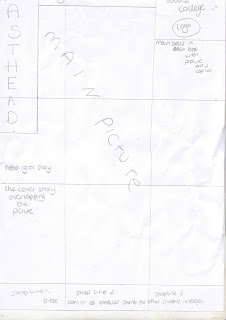
I decided to change my flat plan and trying this layout for my first option didn't work. So i made up a new falt plans that are detailed.


Front cover:


I am pleased with my layout and this is exactly how I want it to look.


Contents page:


Again, I am pleased.


Double page spread:


This took alot of work to get right, and planning for my writing took a long time. I didn't know what image I was going to use or whether this was the layout I wanted. But I liked it and decided even if it is simple it still looks good and attractive for my audience.

Tuesday, 3 November 2009

blog 3- analysis of existing magazines for main coursework

This is the front cover for the music magazine NME. it is a weekly issued magazine and judging by the statistics, the total of people that read the magazine is 388,000. this is around the middle of the popularity renge of genral weekly magazines. the statistics show that more poeple in the classes ABC1 by the magazine than classes C2DE which is interesting as more than a third of those classes that buy the magazine are people between the ages of 15-44. for my target audience i have afound a balance fro my age group and made it between the ages of 14-37 to attract a younger and varied audience.
the front cover has an informal feel as it using sans serif fonts. this creates an attractive and enticing way of appealing to an audience of the ages between 15-44. the masthead is block fonts and red which all the front covers of every issue of NME have creating a memorable layout for the audience as they know it is NME for their style of writing and colours. they also use yellow fonts which creates a formality as the ausience can see it is NME. the main sells titles are all in bold and red and the information about the articles are in black and smaller fonts. this creates a stylish and effective way of bringing an audience in about what is in the magazine as it is clear and bold. the main cover image is on the right side of the cover with the title of the interview in white font. this is cleverly contrasted as the band on the front are wearing black, and the information is in red font which is attractive as it all matches. the fonts are in italics for the quotes used and to make it more exciting, because ot was the bands first interview, they are in italics so that as it is the first interview, people will want to know what it is about who like that particular band. they have used shapes such as a circle to attract the audience of a nnew album and used yello font within a black circle. it looks bold and would attract a reader who likes that particulr artist. on this particular front cover, it hasn't got any strap lines along the bottom compared to others that i have looked at. i think this is because the band are so well known to a particualr genre of music, they didn't need anything esle as they are quite popular. instead, on most issues i have looked at, they have a headline above the masthead which gives extra information about what elese is in the issue. it is bold and striking and looks attractive so you immediatly know what is in the magazine. underneath the masthead is i would say a tagline which is the "New Musical Express" which is also what NME stands for. this is exciting as you instantly know that the magazine is about new music and news on upcoming bands.


this is the front cover for smash hits magazine. i decided to analyse two contrasting magazines as i want to create a magazine that combines with both of these genres of music and also things like gossip columns on particualr artists and pages where the audiecne can send their views in on debates and news on artists. compared to NME, Smash Hits has a very informal look on the front cover as it looks more appealing to an audience between the ages of 11-19. this is a much smaller spread audience to NME. it looks between these age gaps as the main sells and images are placed randomly and roatated slightly which gives it a more informal edge and feel. similarly to NME, smash hits uses sans serif fonts and formats like word art to create an attractive and appealing image to the audience.
the masthead looks bright and exciting using italics and two different colour to make it stand out so the audience know what magazine it is. similarly to NME, there is also a headline above the masthead which is an add on of information that the reader will see. this attracts the reader to be drawn in as it is a different block colour to the rest of the shapes and images on the cover and has a popualr TV show interview in it. there is a logo and a tagline above the masthead,. the logo is colourful stars varying in sizes and the font of the tagline is in simple black sans serif font. unlike NME, Smash hits has main sells on either side of the main cover image which ae in all different shapes and sized boxes and colours with images. this looks fiun and exciting to a younger audience which is what i want to create on my front cover, something exciting but attractive for an older audience also. the title of the main cover image is simialr to NMe's issue as it is right in the middle of the image and stands out by using contrasting colours that look great together. unlike the NME cover issue i picked, smash hits has strap lines runing along along the bottom of the cover with a pink box next to it saying "plus" which indicates what else there is in the magazine. equally, for both magazines their barcodes are in the exact same place along the same way which indicates that there has been the use of the rule of thirs within the designing process of the covers as they are less poigniant and seen to the audience's eyeas they are more likely to be attracted to the points of power which would be the right and left side of the main cover image and the main sells.

i decided to analyse the contents page of the NME magazine as it supports my point of a magazine keeping formality through the colours, colour and style of fonts and layout by using shapes. this makes it look more professional as it is using the same colour throughout the magazine. they have used the same format of the magazine name as on the front cover and used the idea of a headline above the name of "this week". this indicates it is the contents page as it is in bold black lettering with a date underneath which is used as a navigator to show the audience what week it is released. along the left hand side of the magazine, they have a band index to inform readers of new and upcoming music/gigs. there are navigators next to these as they have page numbers for each band. to ensure that the reader knows what paget hey want, all the pages are under sub headings all in the same format and style to make it clear where each story is. these are all navigation elements within a magazine. these are there to haelp the reader know where they are going for a particular story. there is an advert underneath the the cover story information which is a relevant advert as it is for the audience to subscribe with the magazine.all the colours of the images and fonts and shapes match which makes it look professional. the cover story title is in bold and black writing with an introduction to it on red italic font. this coordinate well an makes an impact of making the story seems more intersting and impressive.


for this double page spread from NME magazine. on one full page there is an image of an artist which shows that they are new and exciting as the headline on the top left of the page tell us it is new. this is also a navigation element for the reader to know that they are on the right page for this particular sub heading from the contents page. overlapping the image is a blue box sontaining text with a bold title saying "need to know" which the reader will be drawn to read as it is clear and easy to see as it is near towars the point of power on the gridlines. there is a new set colour scheme of black and blue and a varied style of fonts used as the headline of the page is in serif font. this in no means doesn't make the page informal, but gives it an edgier feel and sends importance to it as it stands out to grab the attention to the reader that it is a new band. along the left hand side of the next page is the text body of the main story with another image along side it and a caption to indivcate what it is there for. there are quotes which are in white font with a blue box surrounding it. at the end of the text is more information about the article on the website whch is a navigation elemnt used for the magazine as it is showing their website address. next to the text body is a black box with images and snippets of information inserted into it. it gives new information about new upcoming bands. i would like to use this feature on my double page spread as it give extra information.


blog 2 for main coursework -target audience

My target audience is going to be aimed at people who like upcoming new bands and music. I would like to make it appeal to everyone but I am basing it around rock and pop magazines such as NME and Smash Hits. Although they are very different, I want to create the very first music magazine that will appeal to lots of people. Be a pioneer!
The sort of person I am aiming for is someone who goes to any sort of concert whether it's bands that they like or hate or that they haven't heard of before. I'd like to also appeal to the sort of person that likes to get in the know of new bands and events and the charts of today. I'd like she/ he to listen to music in any way that they can and watch music channels, especially NME and MTV 2. I want it to appeal to people that are up for anything and have active social lives through music tastes comparing with other people. The pop side of the magazine I want to appeal to someone who has guilty pleasures in some of the dominant music of the charts today. Looking at the statisics of the NME magazine and what age, class and the number of people that buy it, I would like to aim my magazine for peopole between the ages of 14-37 as I feel that people between these ages are more likely to read the magazine as they would have a little more time and acknowledegement of todays music. Using Audience Demographics (socio-economic classifications), I want it to appeal between the classes of C1-D as i don't want working class people or unemployed people to think that they can't enjoy all sorts of music. The problem with categorising classes as you don't know how much people earn as for instance a plumber in class C2 might earn more than a college lecturer when they are in class B. it is difficult to define a certain class for my music magazine so i want to make it as widespread as possible. this maybe a challenge to appeal to the E class as they may not be as educated as say class C1-D. i will have to think about my language when writing the article and double page spread so that less educate4d people can understand it. however this can cause more problems as I cannot tell how much people spend and what is going out of the income. the classes concern the income of the household only. this then leads onto other magazines looking at the ACORN system and Psychographic ways of classifying people and categorise poeple into "consumer personality types". psychographics are divided into five different categories: mainstreamers, aspirers, succeeders, individualists and carers. i think that i want my target audience to be more in the individualists category as i feel that they would have an alternative taste in music to other people. thses categories are what marketers also think about their advertisements in a magazine so an individualist advertisement will be things like competions for gig tickets that maybe only a select few of the readers like, like what i am advertising in my contents page. i would like to attract poeple within the categorys of YAKS which are young adventurous keen and single. these are known as profiling categories.

Wednesday, 21 October 2009

Flat plan and real contents page for my preliminary


my contents page is very simialr to my flat plan original thoughts and ideas as i didn't want to change things too much. i made one picture at an angle to add more excitement to the page. i did this on my front cover where i rotated the cover story information a little to create a feeling of mess and disorder at the same time keeping order. with every title of a page, i added information about the story and gave a page number reference. i didn't want to give the contents page a number as i would have ended up with an uneven page number in my magazine. for each title and iformation, i used a different colour and the same for the page number. i used the same sans serif font i had before to create a sense of uniformity throughout the magazine. i used the same coloured background as my front cover and the same colours for my font. i decided to make the writing at size 18 which was a bit bigger than the writing on the front cover as there was more room to fit the information in in that font size. if i were to improve my front cover i would probably do the same as i would of done for my front cover and make it a more unisex magazine to poen up to a wider audience.

Preliminary collge magazine front cover flat plan and final cover


This is my front cover flat plan and i have stuck to my original layout in my preliminary magazine. i thought it would be a fun layout and appealing to my target audience of girls between 16-21 that are students at the college. i used the rule of thirds in my plan and followed the lines as the point of power was on the picture. my image fitted in nicely with the left hand point of power where the eye is drawn to my friend blowing a bubble. the colours i had chosen was meant to be for both a male and female audience but from a male opinion it appeared more as a female magazine so i changed it to be targeted for female audience as it didn't seem appealing to males. the colour scheme was electric and bold colours with a black background that would follow throughout the whole magazine. my main picture took up the whole of the cover and then my main sells, strap lines and cover stories overlapped it like in fashion magazine "vogue". if i could improve on my next piece it would be to appeal to both genders and a wider audience by drawing them in with a front cover that is exciting, attractive and covers all interests in music. the main aim of my magazine cover is to intoce a wide audience of students within college. Idecided to call my magazine "FRESH" as i felt it was new and original and appealing to newer students also. i used sans serif font for my front cover and contents page as i wanted it to seem informal and inviting. the font face was Arial for Autograph which was appealing and not too hare to understand. for the masthead i used bigger sizes and extra bold. i chose in my tag line to make the work "ultimate" stangd out from the other words as it is putting across that it stands out and the only magazine for their particular needs. i used different coloured letter for my masthead and the same coloured lettter for my tag line to make it more intersting and attractive looking. MASTHEAD = size 48 and making the letters go down as if it was falling: like the ID magazine.
i usd the stroy font size as 18 and the strap lines 14 so that all the information could fit into the box. i made an issue number and the date. this was nummber one issue dated in September as it i wanted it to be like it is the first one so people will get it as it is new.


Tuesday, 20 October 2009

INTRODUCTION TO PRELIMINARY COURSEWORK


For my Preliminary coursework, i decided to do a magazine that targeted mainly the female students of the college and setting out the colour design in that way. At first i thought it would be appealing to both boys and girls, but other people's opinions didn't see it that way so my plans schanged to make it a magazine for girls instead. i used two images that i thought would be interesting for all students across the curriculum and every issue there would be a different course advertised or shown in it. i chose to use a final image from my photography that i took as i thought it would be useful for new AS students to find out what other people did and how creative some are. i then chose to use an older picture that i took of my friend blowing bubbles and based a story around that it was a fundraising event (Children in Need).
i think it looks fun and appealing! i chose to use this picture with the bubble in as it was a good and intersetinf shot at an angle but getting her face and torso in the picture holding the bubble stick. i chose to take it at an angle as i didn't want one facing straight, i wanted it to be interseting and fun. i arranged my front cover with this picture as the main flash as it was the main story of my magazine for a fundraising event and used my scanner art as a side story as one of my main sells and added information about each on what they are about and what page they are on.

Briony Barrett blog 1 introduction-main task.

The task for my main coursework is to come up with a music magazine and to develop my skills further on from my preliminary task of making a college magazine. I will focus on music that I like and I feel would apply to only a particular audience but might also attract others as it will have a lot of new music information. My plan is to base it around the magazine NME as I feel it attracts many people's views and opinions on new music. This genre of music will be mainly rock/alternative and indie but a mixture of all types and the charts of today. I will also include new artists upcoming in local areas for instance my friends who are in bands and have had a music video shown on a music channel and to also advertise MySpace as a way of communicating new music across to young people.