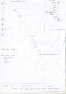

This is my front cover flat plan and i have stuck to my original layout in my preliminary magazine. i thought it would be a fun layout and appealing to my target audience of girls between 16-21 that are students at the college. i used the rule of thirds in my plan and followed the lines as the point of power was on the picture. my image fitted in nicely with the left hand point of power where the eye is drawn to my friend blowing a bubble. the colours i had chosen was meant to be for both a male and female audience but from a male opinion it appeared more as a female magazine so i changed it to be targeted for female audience as it didn't seem appealing to males. the colour scheme was electric and bold colours with a black background that would follow throughout the whole magazine. my main picture took up the whole of the cover and then my main sells, strap lines and cover stories overlapped it like in fashion magazine "vogue". if i could improve on my next piece it would be to appeal to both genders and a wider audience by drawing them in with a front cover that is exciting, attractive and covers all interests in music. the main aim of my magazine cover is to intoce a wide audience of students within college. Idecided to call my magazine "FRESH" as i felt it was new and original and appealing to newer students also. i used sans serif font for my front cover and contents page as i wanted it to seem informal and inviting. the font face was Arial for Autograph which was appealing and not too hare to understand. for the masthead i used bigger sizes and extra bold. i chose in my tag line to make the work "ultimate" stangd out from the other words as it is putting across that it stands out and the only magazine for their particular needs. i used different coloured letter for my masthead and the same coloured lettter for my tag line to make it more intersting and attractive looking. MASTHEAD = size 48 and making the letters go down as if it was falling: like the ID magazine.
i usd the stroy font size as 18 and the strap lines 14 so that all the information could fit into the box. i made an issue number and the date. this was nummber one issue dated in September as it i wanted it to be like it is the first one so people will get it as it is new.
